Look, the GTA Trilogy remaster trailer looks great. It appears Rockstar has really taken its refresh of GTA 3, GTA Vice City and GTA San Andreas seriously, with improved detail, lighting, colors, weather and additional items and decorations added to scenes throughout the games.
The inside of CJ's house now looks more like a home where people eat, sleep and put their own personal stamp on, while the Miami-like beachfront street in Vice City looks even more vibrant and 80s – we also love the art style choice from Rockstar and its partner studio Grove Street Games, as it's avoided hyper-realism and kept some of the cartoony flair of the original games.
It's all sounding positive then, right? WRONG. There is one particular scene which actually looks worse in the four seconds or so it appears on screen.
Sin City
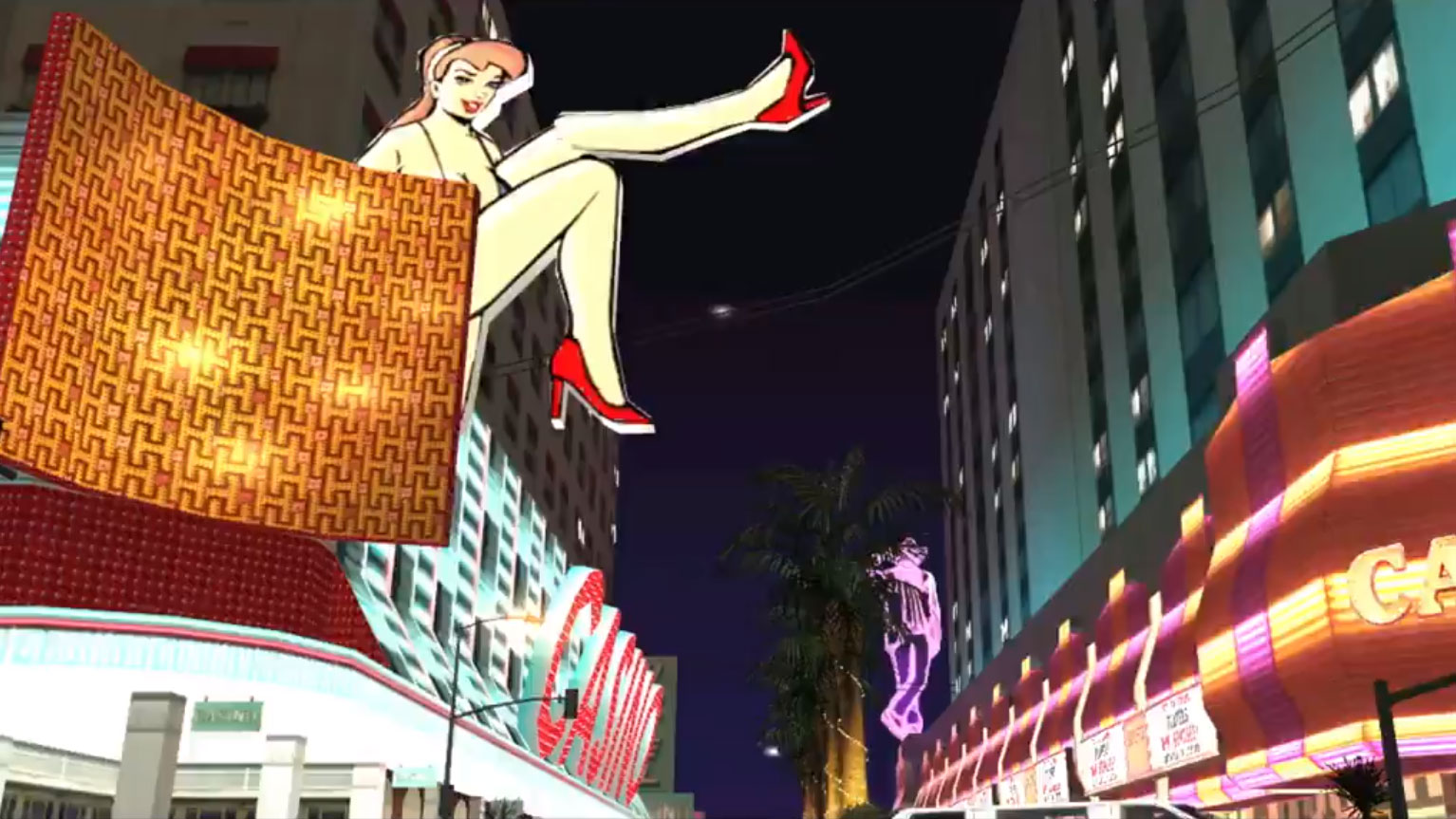
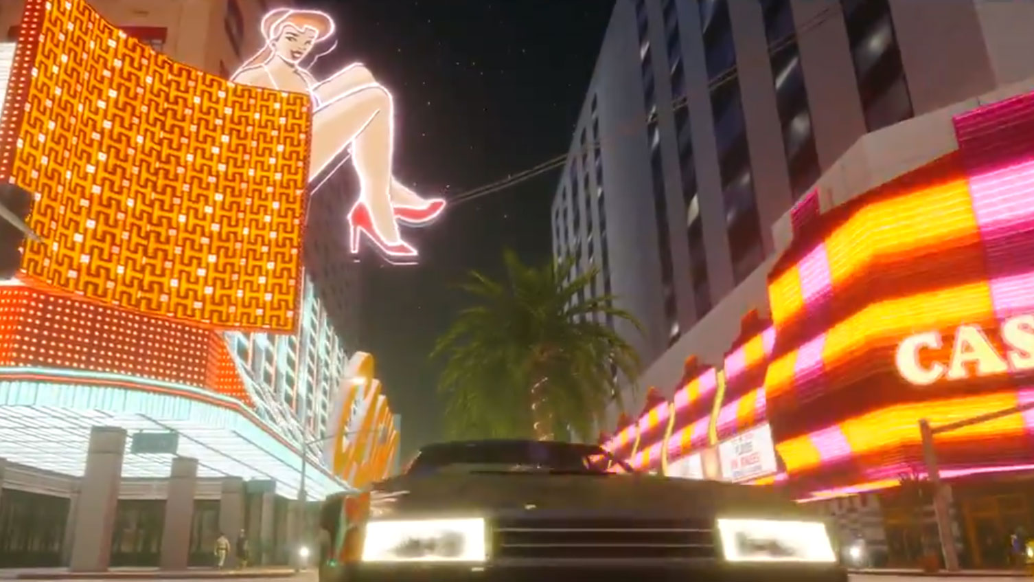
The scene in question appears 24 seconds into the new GTA Trilogy trailer and shows a street lined with neon-clad casinos not all that different to real-world Las Vegas.
It's from GTA San Andreas and the Las Venturas area of its sprawling map, giving us a view down a street. As the trailer transitions from the original game to the remaster, a car drives towards you.
What jumps out though, unlike any of the other transitions in the trailer, is the original actually looks better than the remaster at first glance.
It's also the only brightly-colored night scene that features in the trailer, with another clip showing a neon-clad, Ocean Drive, Miami-like street in Vice City captured during daylight hours in the game.
This leaves me wondering how scenes like this will look when the game time reaches night – are we going to see similar hazy visuals and slightly awkward lighting?
This is subjective to the eye of the beholder and if you look at the reflections of the casino lights on the car's paintwork as it zips past the camera you can tell the remaster does handle certain elements better than the original.
This is also just a short trailer uploaded to Twitter – the game is yet to reach the hands of anyone to experience on their big TVs or high-resolution PC monitors.
There's a way to go then, but this is a curious quirk in a trailer that otherwise hits all the right marks. Something just feels a bit off.
You can view the GTA Trilogy trailer below
Analysis: why does it look worse?
Gerald Lynch, Executive Editor at TechRadar, offers some insight:
Whereas the majority of the trailer looks like a superb upgrade, as I'd said in my earlier piece, I agree that the casino strip scene looks odd.
Here's the one moment where melding the old style with the newer technologies available is actually detrimental, in my opinion.
The original game had to hide its graphical limitations, especially in terms of lighting. But as we all know, the flashy lights of a Las Vegas-like scene in the real world is what makes such a location so glamorous and enticing.
In the original, the developers get around this with charm – here are riffs on iconic Vegas neon signs, drawn in exaggerated fashion to draw the eye.
But when the new games' enhanced lighting effects are added to the mix, their admittedly-more-realistic glow actually acts to weaken the overall scene.
The quality of the underlying designs is washed out by the halo of lighting effects being added. You lose some of the illustrative contrast of the sign featuring a lady, as the neon-elements soften its originally-bold, pop-art-like silhouette.
For the most part, I think what we've seen of the remastered trilogy's visuals does a fantastic job of walking the line between original artistic intent and the positive possibilities of applying newer visual technologies to a scene.
But this shot proves that just throwing new tech at a classic title isn't always a silver bullet for enhancing something, and that even the most exciting of new technologies, be that ray traced reflections or high resolution textures, have to be applied with a careful eye towards environmental dressing and location design, too.
- GTA Trilogy remaster vs the originals : see the differences
